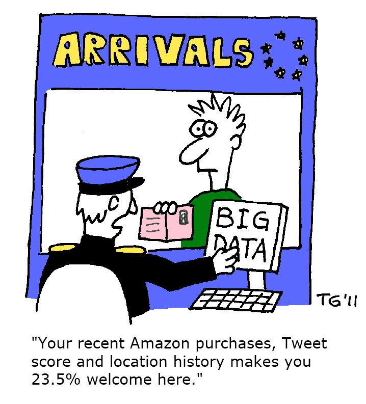
Data mining, part 2

The Woman in WhiteThe Woman in White

This is my word cloud (with omitting “said and say” stopwords, although that might be interesting too as an analysis of the narratology of saying versus showing).

Google n-gram

I have been thinking about what “data” might mean for some of my work, and it isn’t obvious what would be a good category for this kind of research. I also work on ekphrasis in Roman poetry, but ekphrasis in this context isn’t manifest by signal words that I could use for different poets. Instead, Roman poets intentionally chose polysemous words, which had meaning in Greek and Latin, and prided themselves on the wordplay that that would allow, and particularly Augustan and so-called Silver Latin poets tried to be as opaque and allusionary as possible in the poetry. So one of the things that I’ve been grappling with is the idea of how to capture that kind of wordplay in a large database or is it even possible to do so?

Another question that I’ve been considering is the one about data in relation to the construction of meaning; that data isn’t “natural” or “unmediated”, but that the “cleanest” data has less interpretive baggage to dirty up the analysis. I need to think some more about this issue of data, what it is and isn’t.

Source: Data mining, part 2

Day 7: The Power of Visualization

Untitled

I am indebted to Spencer for teaching us his formulas for some of our data. I am not the most skilled person with Excel. For my work on the Sacred Heart, I’ve always wanted to make a chart like the above of the percentages of Sacred Heart texts published in different countries in the eighteenth century.  I probably should have Googled it and learned earlier, but I didn’t and know I’m not sure why.

And look at how beautifully it displays my data (disclaimer: it is not all input; this represents only 71 texts out of hundreds–stay tuned). In a simple, straightforward manner, it conveys that Mexico published many texts on the Sacred Heart between 1700–1850. I was only able to develop such a nice pie chart after inputing my data into a spreadsheet. This also required me to tidy my data; it turns out it was really messy!

tidydata_memecat

Our discussions over the past several days have impressed upon me the necessity of tidy data. While I always organize my research (my data), I realize that this doesn’t necessarily translate to tidiness. Creating a few excel spreadsheets with this in mind, I was able to make the pie chart above as well as input my data into a few other programs that visualized it in different ways. I also input some of it into Timeline JS. Rather than input individual items one-by-one–and with nothing to show but the final product–the detailed, tidy spreadsheets I’ve been working on this week transfer between many programs and platforms. I see this transferability as an essential ingredient for any project, particularly at the early stages of it when you might explore and tinker.

I’m also going to experiment further with Palladio. It offered interesting possibilities for data visualization that could be useful for my project.

Source: Day 7: The Power of Visualization

Instruments

At this point in the schedule, I’ll have to confess to conflating some of the many, many new cloud-based and land-based (?) software programs we’ve learned. In an effort to keep track, here’s a (still growing) list of all the tools we’ve been exposed to that store data, collect images & other files, interpret & annotate images & video, and visualize data :

Abraham Bloemaert (Dutch, 1564 - 1651 ), Saint Bernard of Clairvaux with the Instruments of the Passion, , pen and black and brown ink, with gray and brown wash, black chalk, and graphite on laid paper, Joseph F. McCrindle Collection

Abraham Bloemaert (Dutch, 1564 – 1651), Saint Bernard of Clairvaux with the Instruments of the Passion, n.d. National Gallery of Art. Source: ngaimages.gov

Zotero (data collection)

Omeka
(.net & .org versions—collection-building, exhibition-building, map integration & more)
Scalar (collection building, annotating videos)
Drupal (site building)

Prezi (Kimon’s suggested use: organizing images)

ThingLink (annotating images, sharing annotations)
YouTube (annotating videos)
Animoto (creating video stories)

Google Map Engine
(Lite—creating custom maps, working with kml data, e.g.)
Google Fusion Tables
(many uses for manipulating & sharing data, creating social network visualizations)
NYPL’s Map Warper
(Spatial/temporal: historic/modern map comparisons)
StoryMap (“Prezi with a mapping interface”)

Comment Press (Open source publishing)

Google nGrams (Word frequencies using Google Books corpus)
Bookworm
(Word frequencies using Open Library, Chronicling America, SSRN, etc., corpora)
Voyant
(Text analysis: word frequencies, trends, including Cirrus, Bubblines, Knots plug-ins)
OpenCalais (Semantic analysis)
ViewShare (Data visualization)
ImagePlot (“Distant reading” of images; vizualization of image data)
Palladio (Data visualization)
Excel Charts (Data visualization, etc.)
Colour Lens (Collection analysis by color)

Source: Instruments

Day 6: Delving into Data Mining

Back after a weekend break, ready to stuff more new information into my organic content management system (a.k.a. brain). This week we will see just how much will fit in there!

Brain.old.pictureRobert Fludd, Utriusque cosmi maioris scilicet et minoris […] historia, tomus II (1619), tractatus I, sectio I, liber X, De triplici animae in corpore visione (Wikipedia Commons)

I like that the day often begins with an introduction to a tool that is super easy to use. Today that was Google Ngram Viewer that you can use to compare word frequency in all the books that Google has scanned as part of its Google Books project. I tried “Latin America” and “South America,” and it looks like this:

(Ugh. That’s A LOT of empty space there between the chart and the text, and I can’t seem to fix it. Clearly I do not get all the ins and outs of WordPress.) Although the tool is limited and even problematic (how to determine exactly what the data set was? Does Google publish a list of its books?), I can definitely see using it as a teaching tool, for example to show my students that the term “Latin America” is recent, and that scholarship on the topic has peaked at particular times that correspond with (or follow) political interest in the region. We also looked at Bookworm, which performs in a similar way on different repositories of digitized texts.

So then we moved on to slightly more complex tools for data analysis, Voyant and Open Calais. Spent a good bit of time playing with Voyant. Again, I can see the potential, perhaps especially as a teaching tool. I am intrigued by what these tools can potentially reveal about what’s in the text.

Screen Shot 2014-07-14 at 9.57.28 PM


Accessed at http://search.dilbert.com/comic/Data Mining

Okay, so I love the idea of using data mining for analyzing internationalism vis à vis biennials in Latin America, but like most other participants at this institute, I don’t have a lot of digitized text available to analyze. I’d like to analyze biennial reviews, for example, but those I have are PDFs and would need to be OCRed (I’m sure I’m not using the terminology correctly!) before I could use digital tools to analyze them, and even then, I’m not sure that the volume of text would be enough to make it worthwhile. I’ve learned, for example, that to do a good topic analysis, I’d need a minimum of 1,000 texts. So reserving judgement of data mining as it might apply to my project and looking forward to talking about visualization tomorrow.

(A small mystery that’s bugging me: why does this post show up as having been put there at 2:02 am on Tuesday, July 15 when it’s 10:11 pm on Monday, July 14? It’s not my computer clock–must be the clock linked to the host?)

Source: Day 6: Delving into Data Mining

Beauty vs. Space

Today we tried out a  number of data mining programs.  I like the term “data mining:” it seems an appropriate way to think about digging deep, with some goal in mind, finding raw glittery things that need to be handed off to a skilled person to consider, judge, cut, polish, and set.

Graphs can be really compelling, for they so swiftly and decisively draw conclusions from piles of data–in this case, books published from 19th to 20th centuries analyzed for the frequency with which words appear. They’re also dangerous, I know, for they are certainly light on nuance. But I guess that is the role of the scholar: to understand the context and ask the further questions to properly position data that appears so spiffy and commanding into a broader consideration—or, alternately, to just go ahead and use it as proof of the devastation brought to centuries of architectural tradition (beauty) with the advent of anti-aesthetic concepts (space).  Especially considering this graph, in which the lines cross at 1907–the very year that Peter Behrens was named design director for the A.E.G.!–I can maybe see how a person might be tempted to do that.

Source: Beauty vs. Space

Day 6: Data Mining

Today we played with several tools. I already posted the visualization of words that appear multiple times in an article by Anne Derbes. That was cool. Only, I don’t know how I got a PDF to work in it because they are not supposed to work. I don’t have any idea how I might do that again. I tried tonight; no go.

Tomorrow we dive back into data mining, but we talk more about visualizations, and what I think I heard was also a discussion of how traditional DH text mining can be translated into art historical methods and processes. Because we do sort of work with images. Texts are all nice and everything, but art historians tend to gravitate towards seeing stuff (I have remarked that Sheila and Sharon must get a kick out of what we ooh! and ahh! over; every now and then some visual manifestation appears and you’d think we were witnessing a new heavenly orb based on our reactions).

Tonight I did another ARTstor search (logging on through my school’s off-campus log-in account). I found a few more images of the Eleousa-inspired Italo-Byzantine panel paintings. Right now I’m dealing with bust-length, 13th century, Tuscan-produced versions. I have about 10 of them. Several of the ARTstor ones are black and white (whaaaa) and I may try to run a TinEye search to see if I can find other ones. I think one was from that photographic Frick collection that was in one of our readings.

But my questions tonight are:

1. How can you (or can you?) export ARTstor image metadata into a file? They have the Offline Image Viewer and a way to export the IMAGES into Powerpoint…but what about the data? I am salivating over the idea of being able to take a whole image group (like my bust-length Eleousa-inspired Madonna and Child image group) and get ALL THE INFO in an excel spreadsheet. Oh, how fab if you could do that….can you do that?).

2. How can I find better quality digital images of these black and white ones?

3. What questions do I want to ask of these images? Do I want to make a searchable database? What are we searching for? My initial thought is to start with the Eleousa-type images. The Eleousa type of Virgin and Child picture in Byzantium is like this, on the left below, known as the Virgin of Vladimir from 1130 or so  (and it is one of my favorites of all time):

(9-29)virgin(theotokos)andchildicon(vladimirvirgin)-m1323971654402  lot-5 (2)-1

And then the one to the right above, which is an Italian version of the Byzantine theme from around 1285-90.

In this case the compositions are “flipped,” and there are other iconographic differences as well.  But I’m not sure how DH inquiry is going to help here. I need to talk to more people about this – and think about it more.

4. I am still on the fence about mapping. In many cases the provenance of these images falls of the edge of the earth around 1920. Most do not have provenances (that I have been able to find) that reach all the way back to the thirteenth century. So mapping their location at creation might be a dead-end. But maybe searching by iconographic type? I mean, I have had to do a TON of work just finding all these suckers and then arranging them in a way that they are grouped and thus comparable. That’s adding to the field, is it not?

Still thinking. And looking forward to tomorrow.

Source: Day 6: Data Mining

Day 6: Mining Data

I had high hopes for the applicability of data mining to my current/future project and my long-term research on the Sacred Heart. I’ll largely discuss my research on the Sacred Heart because I’m familiar with the material, having worked with it/on it for the past decade. I thought it would be useful to have a “safety” to see how well these data mining tools work. Verdict: so far, I’ve not been impressed with Google N-grams or Bookworm or Voyant or Open Calais. I hesitated to write this, if only because I imagine some of my cohort found at least one of these programs useful. Or so I hope. I felt frustrated with Google N-grams and Bookworm in particular. I couldn’t find useful sources that relate to my project, so I decided to try them with material related to the Sacred Heart. The results came back from both, and I noticed how skewed the results were. No texts published in Mexico between 1730-1748? Incorrect. And where were the spikes in the early nineteenth century? My excitement turned to skepticism. What was Google using to gather this data? How was it sorting it? Did accent/diacritic marks make a difference? How can I use data that is skewed, if at all? How do I know when the data isn’t skewed? I felt similarly with Bookworm. These programs definitely seem to have an inherent Anglocentrism, which is not to say that they cannot be improved to correct that in the future. But for now I don’t feel I can use them in any meaningful way.

Voyant similarly saddened me. What high hopes I had for mining my PDFs! Alas, they were dashed. Instead, I inserted by book manuscript on the Sacred Heart. While not relevant to my project, I was delighted to see how the program mined my manuscript and visualized my top words choices. See:

  index2cloud

And another graph that Voyant generated for me displays where certain keywords are used most often in specific chapters.

chart

Overall, I left today realizing that text mining still needs development in many areas. I also believe that it is not as relevant to many art historians because text mining doesn’t apply–at least as it was defined to day and I’m using it here–as data mining of say archival documents or images (if that’s even really possible at this time).

A major point I did take home today–thank you Lisa Rhody–is to make sure I have tidy data. After our discussion today of structured vs. unstructured data, I began to think of ways to create tidy data for my current book project on the Sacred Heart. Long ago I created a .doc that contained important events, object production dates, publication date of texts, and more that I arranged chronologically. Today I began placing it in a spreadsheet and making it into tidy data. My goal is to map this data–or at least some of it. While not related to my deathways project, this is immediately relevant to my book manuscript. I might even find that it directly affects some of my ideas.

And just for fun…

My Animoto video (I didn’t post one last week, so I quickly made one for show-and-tell):

It’s nothing fancy, but it gives you an idea of how Animoto looks as well as how it might work for a project.

While Animoto doesn’t appear to have any immediate relevance to my project, I do think it offers students a wonderful way to engage with material.

Source: Day 6: Mining Data

Canary in the Data Mine

Confession: Data mining was not something that I was particularly drawn to before attending this workshop. I was unsure of the relevance of data mining to my research questions, and I was highly skeptical of the validity of projects that are premised on mined data. Today I was thrown deep into the data mine.

I wish I could say that today’s session was converted me to the glories of data mining, but I am afraid that I came away with more skepticism about how this can be useful to my research. While it was interesting to use Voyant to analyze texts and Google N-Gram to evaluate the changing use of word usage, I am still hesitant to embrace the validity of such findings. I think that these tools provide an interesting glimpse into texts and the visualizations of this data may even be very compelling, but I am not sure that those findings can be the end of the argument. In fact, I think the greatest appeal of these tools (as far as I can tell after one day in the field of data mining) is that the data that is revealed through these processes raises more questions, the visualizations ask for the inquiry to reach deeper.

Heading back into the data mine for Day Two. I hope I survive.

Source: Canary in the Data Mine

Storymaps

After a week of diving into digital art history, I now have a number of new tools under my belt that will be extremely beneficial to my teaching and to student learning. Last week we were introduced to Storymaps, along with a number of other mapping tools that could be useful in my teaching and research. While I will undoubtedly use a number of the mapping tools for my mural project, Storymaps seems like a relatively simple and effective way to have students map public art walks in the city or the provenance/transit of works of art. I have asked students to do these things in previous classes, but could never find a tool that would be easy enough to demonstrate, yet dynamic enough to fully engage them. Storymaps is well-suited to the goals of the assignments I have designed. More importantly, the learning curve is shallow enough that students will be able to gain competency in using SM without sacrificing content, which has sometimes been the case when I have tried to use platforms or tools in which the learning curve is too steep.

Here’s an example based on my grandmother’s life (I needed a break from murals!):

Source: Storymaps

Thinking About Space

The readings and discussions for today were really interesting, but they again highlighted the myopic nature of my project. (Though I don’t think that’s necessarily a bad thing!) We looked at the fantastic online article Local/Global: Mapping Nineteenth-Century London’s Art Market, one of the projects that I found very inspiring when I first saw it last year. It reminded me of Stanford’s Mapping the Republic of Letters and a talk given by Christian Huemer at ARLIS/NA 2013 called, “Patterns of Collecting: InfoVis for Art History ,” about analysis that is being performed on the Getty Provenance Index. I guess as a visual person, and a fan of maps, I find these kinds of presentations- ledger book entries or archival items projected onto maps and graphs- to be revelatory and fascinating. How can the idea of space work with my questions about collecting and exhibition of artwork by my institution’s founder?

There is certainly a strong and important element of space/place in the story of my institution. We conducted an oral history with our  installations manager who has been with the museum for over four decades and has not only an encyclopedic knowledge of the collection but a strong memory for changes in our galleries and expanding building. The recording/transcript is a valuable resource to consider issues of scale, access, prominence, groupings, and focus as they relate to the exhibition of permanent collection works. Would it be fruitful to create digital scale models of gallery spaces, past and present, for recreating and reconsidering gallery hangings? It is something our curators do in realia when preparing for exhibitions using foam core maquettes. At this point, I feel like that would be more of a digital flourish than a substantive research tool. However, perhaps as I look at the record of display I will see surprising divergences from the way we approach hanging the collection today. It is my sense that we carry DP’s method closely, but maybe that is overly romantic of me.

What other kinds of data do I have at my disposal that relate to space and to our collection? I could certainly compile information on birth and death locations for artists, but I am not sure how much we would learn from that. Provenance data, specifically in this case the location of transactions, could be very useful but is lacking from many records in our CMS. If it is possible, records of international loans could show the reach of the collection. On our blog, we presented a map created by an online tool that displayed locations of traveling exhibitions since the 1980s. I think something similar done on an item-level would be worthwhile though I do not know how that information is recorded. (*something to investigate when I get back next week.)

In the meantime, I will make my contribution to “the field” by participating in New York Public Library’s Map Warper, which is a delightful tool. As I said on Twitter, our group applauded the demo video.
The first map I did went quickly, finding its place along Edward H. Grant Highway in the Bronx. The next one I tried in Astoria was much more of a mystery. I’m not even certain any of the streets I was looking at in the original map are there anymore. (But, if you know Astoria at all, you know it’s not hard to get lost.)

Source: Thinking About Space